ExPat Tax Online
Our client came to us with a list of big problems: their tax questionnaire was hundreds of questions long, unattractive, and users frequently dropped off or needed help. Taxes may seem boring to most, but for this nerdy UX researcher, I was thrilled to sink my teeth into this juicy information overload!
My Role

Information Architecture
UX Research
User Testing
Data Driven Design Iterations
My Team
Yuri Shin
UI Design
Interaction Design
Wireframing

Brittny Fisher
UX Research
Components
Prototyping

Steve Kappel
UI Design
Responsive Design
Wireframing

Constraints
3 week sprint
4 man team
No internal communications outside of client (Dev, legal, etc.)
Unsure of constraints with software
Client Requests
-
– Decrease drop-off rate
-
– Create an aesthetically pleasing questionnaire to be less “Microsoft looking”
-
– Make the questionnaire feel lees arduous and long
-
– Maintain the “traffic light” system for progress states
-
– Better mobile experience
Discovery Research – Competitive Analysis
Competitors
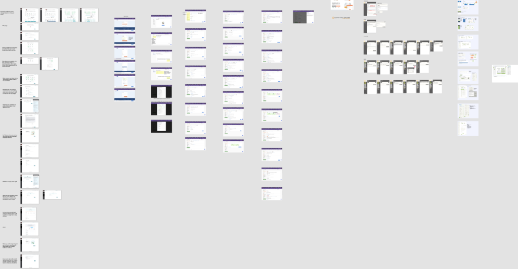
Though not an exact match, we took a look at how other tax sites laid out their tax forms and the tricks they used to make them less arduous. We set a timebox of 30 minutes and each team member had to look at a website and report back to the rest of the group. After taking turns showing our discoveries with the group, we focused in on a few individual features we found to be most relevant to our questionnaire.
Discovery Research – User Interviews
Recruitment
Our client was able to give us recruits for the initial user interviews, who have been doing their taxes with the company for a few years. Because our client’s users are international, we created a Calendly to schedule the interviews via Zoom at their convenience.
We were also able to send our questions to known international ExPats in the local community.
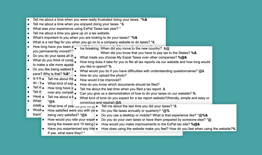
Interviews Questions
We had a discussion on what insights we wanted to glean from the interview and created interview questions as a group with 2 rounds of focused question writing. We then voted on the questions, creating a mix of open-ended discovery questions geared towards features we wanted to know more about, as well as very open questions to see if there was anything we didn’t know we didn’t know about ExPats experiences with their tax forms.
Insights
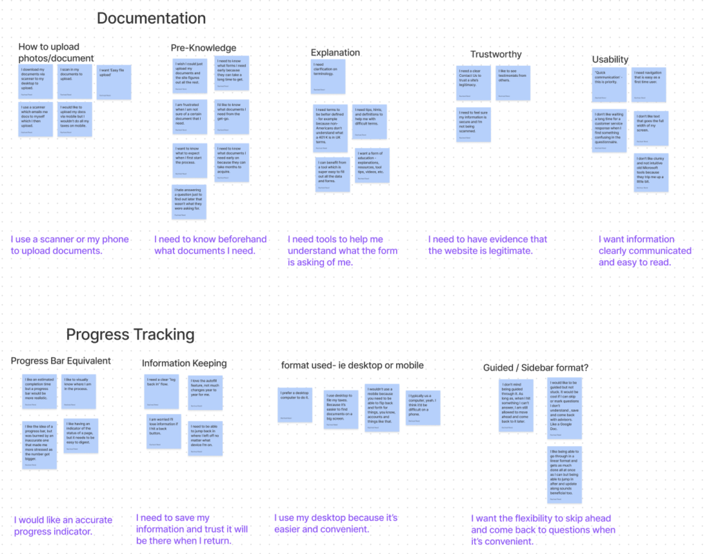
From our interview insights, we were able to derive clear “I” statements that guided our design.
Being an international company, we were able to glean insights into issues that we would not have considered on our own – for example, the equivalent of a 401k in Britain is called something else. This is a common issue, that “accidental Americans ” do not know what qualifies as the type of documentation that is being requested due to the lack of uniformity overseas. This creates a pain point, a need for more in-depth clarification on those pages.
Our main insights were:
-I need to know beforehand what documents I need
-I need tools to help me understand what the form is asking of me
-I need to have evidence that the website is legitimate
-I want information clearly communicated and easy to read
-I would like an accurate progress indicator
-I need to save my information and trust it will be there when I return
-I use my desktop because it’s easier and convenient
-I want flexibility to skip ahead and come back to questions when it is convenient to me
– I use a scanner or my phone to upload documents
Persona

Data-Based Persona
Our client was able to give us a lot of information on three very specific kinds of expat taxpayers – the American abroad, the Accidental American, and the Retiree. The American abroad is someone who is living overseas for a few years and knows American taxes, the Accidental American is someone who had citizenship inherited from childhood and has never lived in the US and is therefore very unfamiliar with the tax system, and the Retiree is a natural American who has moved overseas to retire (often ex-military to Thailand). From this information we were able to create two very different Personas that encompass a large group.
Narrowing The Scope
We were handed over 150 questions from our client, so with our time constraint and such a long laundry list of wishes, we had to narrow down the questionnaire.
By utilizing our Persona as a guide through the questionnaire for our prototype, we were able to make the information more digestible (and let’s be honest, no one wants to see a fake questionnaire go through hundreds of questions) while still managing to display all the bells and whistles we were adding.
By decreasing the content, we were able to focus in on specific features we wanted to highlight and chose questions that would display this.
Sounds easy, right?
Information Architecture
Down The Rabbit Hole
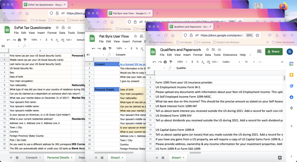
After copying all the questions in the questionnaire, we had to synthesize it into something digestible. This is where I shine.
First we determined which questions triggered more questions (and could therefore be hidden/nested).
Then we linked which questions had what documentation required with them.
Since we decided we wanted to create a pre-screening, I had to re-categorize what we had determined were the main questions and translate them into applicable statements for users (for example: “I owned a home in the US this year”)
Finally, we narrowed it down to which questions would be relevant to our Persona.
Data Driven Designs

Pre-Screening Page
After reorganizing the information architecture, we were able to create a pre-screening page that turned 150 questions into 18 qualifying questions.
This allowed 2 things to happen:
1. Users only saw questions relative to their specific circumstances, greatly reducing the number of questions that are populated
2. Based on this information, we can determine what paperwork they will need to provide.

Documents list and helper text
This is the page immediately following the Pre-Screening, as you can see it lists all the documents that you will need based on how you answered the questions. From here, you can upload the documents on this page or inside the questionnaire when it is asked for.
We are also showcasing the helper text here.
Hovering over the “i” will populate a description of the form. Since we were a group of designers working in a vacuum, we didn’t actually have this information so this is more of a placeholder to showcase how it would look. The form you are getting info on is also greyed to highlight which piece of information you are getting.

Client Pain Points
We asked our client early on if there was any common issue they saw on the back end that were recurring. He immediately told us – dates. In America, we do month, day, year whereas overseas it’s typically day, month, year. This causes issues frequently.
Due to this, we created a very clear error notification with instructions on how to properly write out the date so that out client knows they are getting the correct data on their end.

Left hand sidebar and progress bar
You will notice that after answering the pre-screening the user can now see all the categories they will need to answer. They have the option to skip around and come back, or move through the questionnaire in a guided fashion.
You can also see that the left hand sidebar has progress indicators in the stoplight fashion requested by our client. Green is completed, orange is incomplete, and grey is not started. Utilizing best practices for colorblindness, we also created unique icons to go with each color: check mark with green, dash with orange, and empty with grey.
Progress Bar
Wondering how the progress bar works if each section has the potential to expand? The progress bar is based on the number of categories, not the number of questions, as the number of categories will not increase.

Populating Extra Questions
As mentioned previously, we wanted to lessen the mental burden of our users by only showing questions they need to answer. Here is an example of this, when answering “yes” to a prompt, the user is shown an upload page for documentation. When a question leads to other questions, it is similarly nested below. For non-US documentation, there is typically no paperwork but rather a description, so a fillable text box would appear.

Permanent helper button
You may have noticed a little question mark icon in the bottom corner that is always present. This anchored help button allows the user to contact the company for assistance at any time.
We weren’t able to discuss the limitations of this with developers or the company, so the assumption at this time is that it would send an email – however we would love for it to be a live chat function or a database of information that could be searched.

Overview of progress page
Leaving the questionnaire and coming back was a big priority to users, as was knowing where they were in the questionnaire.
This was our solution for a few reasons:
1. We utilized the stoplight colors to show what pages the user has missing information on
2. You can look at the entire questionnaire at once and only expand upon the parts that you need to work on. You can then click on that subcategory and be taken right to that question.
Maze Testing Results
Maze.co is one of my favorite testing tools, it allowed us to get heat maps of the users mouse and where they click as well as other data like amount of time spent on each page, mis-clicks, and alternative flows utilized by the user. By gathering this data we found a few things that we needed to change on our site.
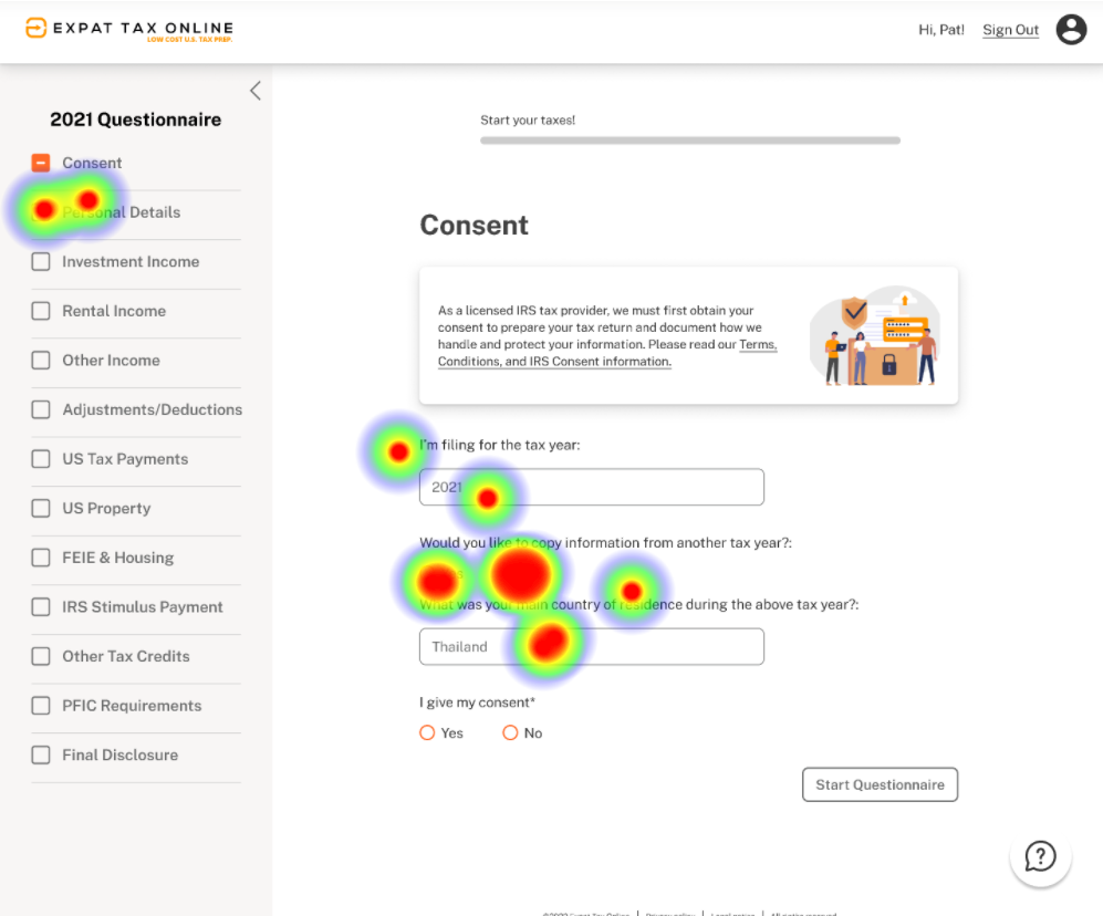
Issue: How do I start?
Users didn’t notice the “Start the Questionnaire” button in the lower right hand corner to get to the next page. This was an example of when convention is not enough.
Our Solution
We changed the button to be the signature orange color used throughout the questionnaire as a call to action color.

Issue: How do I upload?
Users thought they needed to click on the forms in the list to upload, instead of doing a mass upload at the bottom.
Our Solution
We made the forms clickable, which then populated an upload files screen. Give the people what they want!

Happy Users!
Despite the few mishaps along the way, users who were willing to give us a score at the end still gave us a 100% “very easy to use” scoring!
Impact
The before and after of the questionnaire.
Before
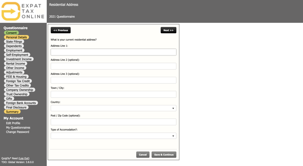
After
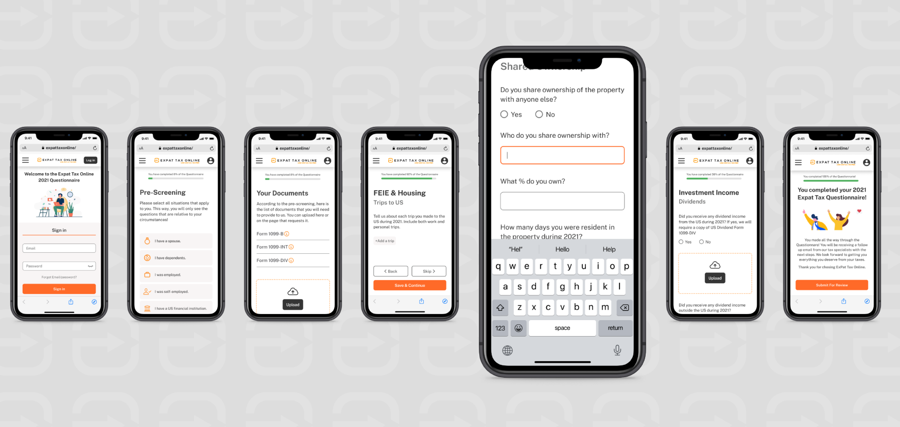
Mobile App
Three weeks wasn’t enough time to completely flesh out the mobile app along with the rest of the redesign and make a prototype. However, our responsive design kind Steve was able to create enough screens to showcase a standard layout across the mobile screens.
Next Steps and Recommendations
Wishlist
- Update ExPat Tax emails to have better branding and uniformity
- Track the analytics of user drop off for the next 2 years (before and after implementing design)
Next Steps
- Determine functionality of the mobile app
- Complete the full questionnaire
- Work with the client’s Dev team and legal to bring this into reality
Continuing the work
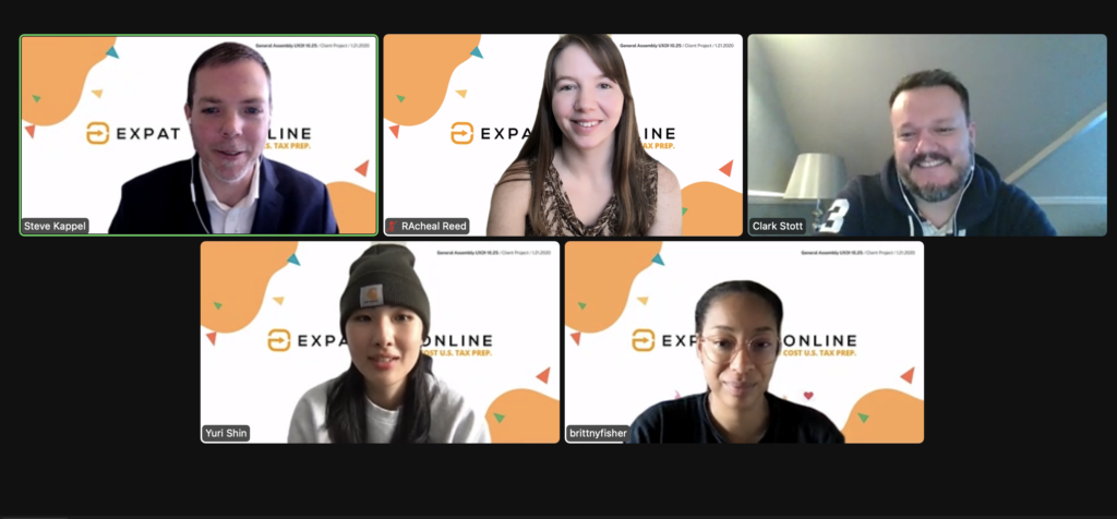
This 3 week sprint started as a project facilitated by General Assembly. However, our Client was so pleased with our designs that we were given a contract to help hand off the project to their in-house Marketing team.
“I presented all your work to my other Directors this week and they loved it! I have a proposal for you…“