Table of Contents
- Discovery Research
- Persona
- Site Architecture
- Open Card Sort Data
- Wire Framing
- Usability Testing & Iterations
- Prototype
- Next Steps
About
Why this project?
This was my first attempt at creating a website for online shopping. The goal was to learn to utilize various tools in Figma and Google Docs to create inventory cards and have my first crack at design. What ended happening however, was I discovered my love for information architecture and data.
Discovery Research
INTERVIEWS
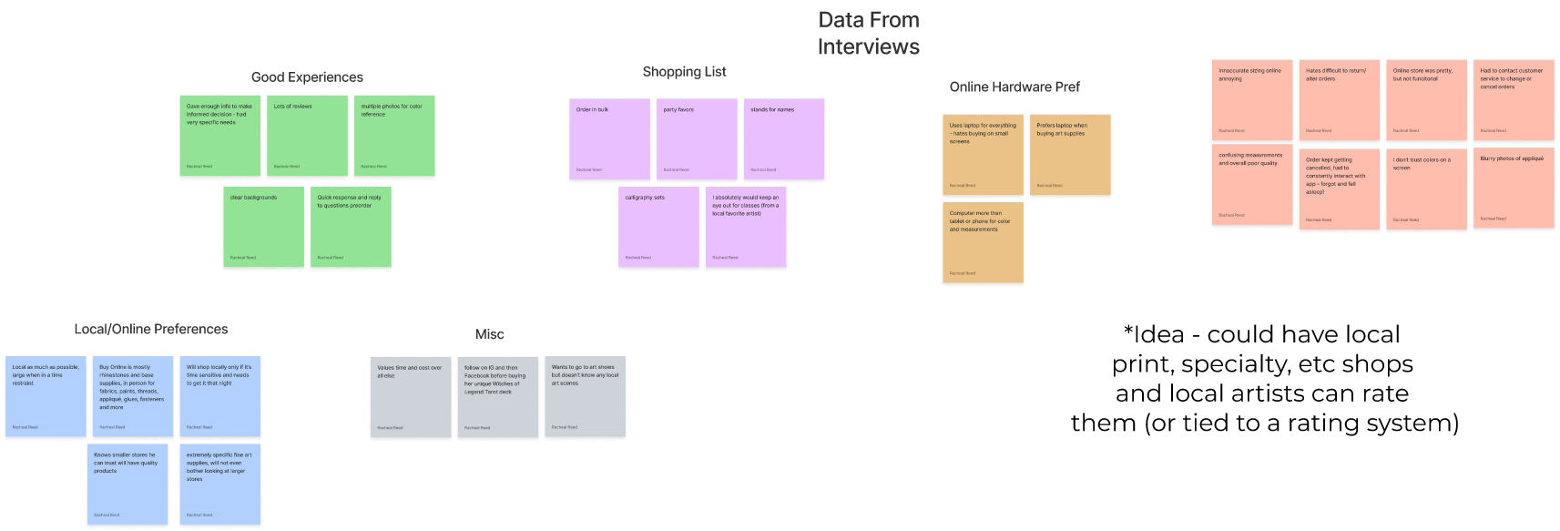
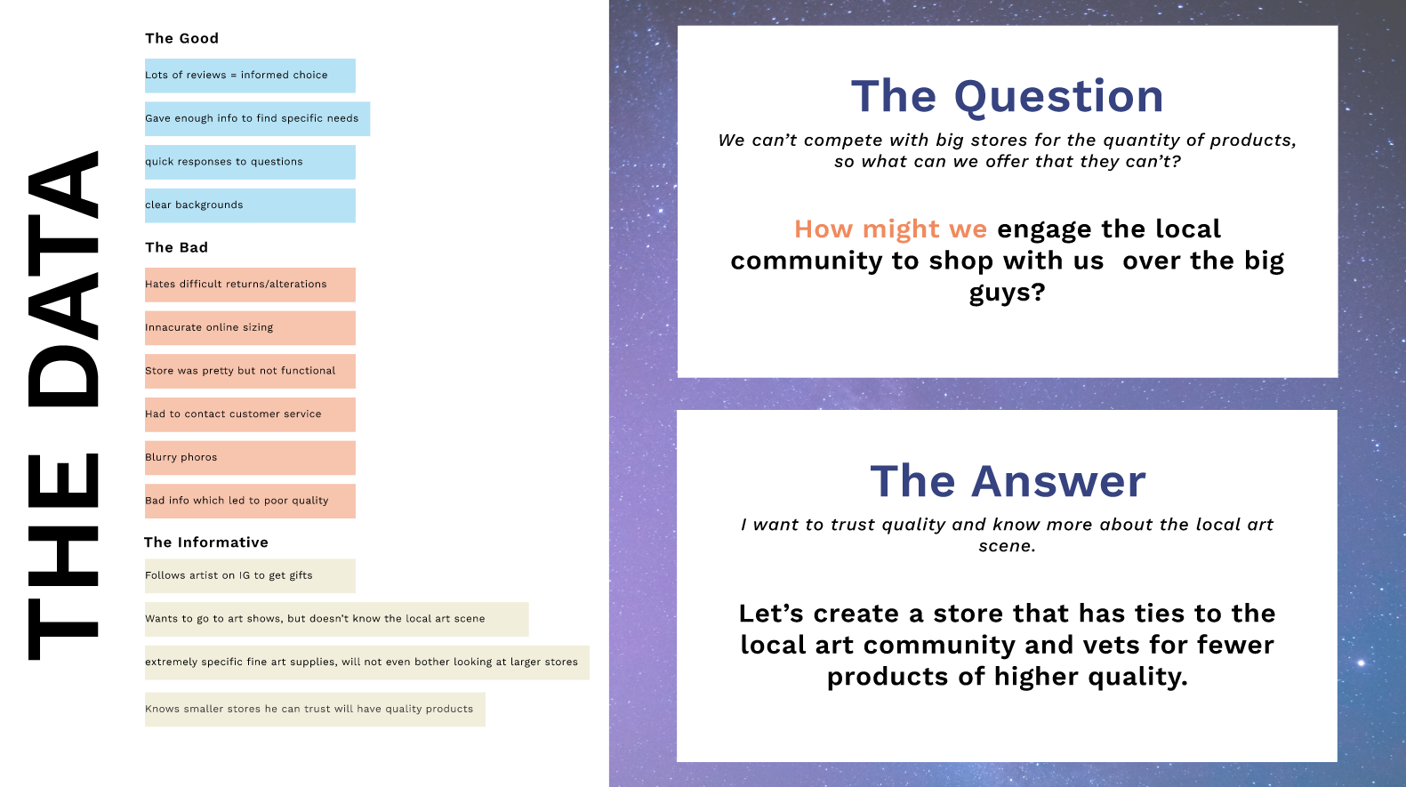
I conducted interviews from self-proclaimed art store frequenters to gather data. Howl’s Art Emporium cannot compete with the mega-stores like Hobby Lobby and Michael’s in their stock size, so it was important to find a cohort that frequented art stores to get to understand what caused users to go to a small, local art store as opposed to a large competitor. Using open questions and allowing users to talk through their reasoning, using the 5 Why’s, I was able to discern a few main themes for small store users: they knew small stores had good quality artisan supplies and they were much less daunting to search when in a rush.
Persona
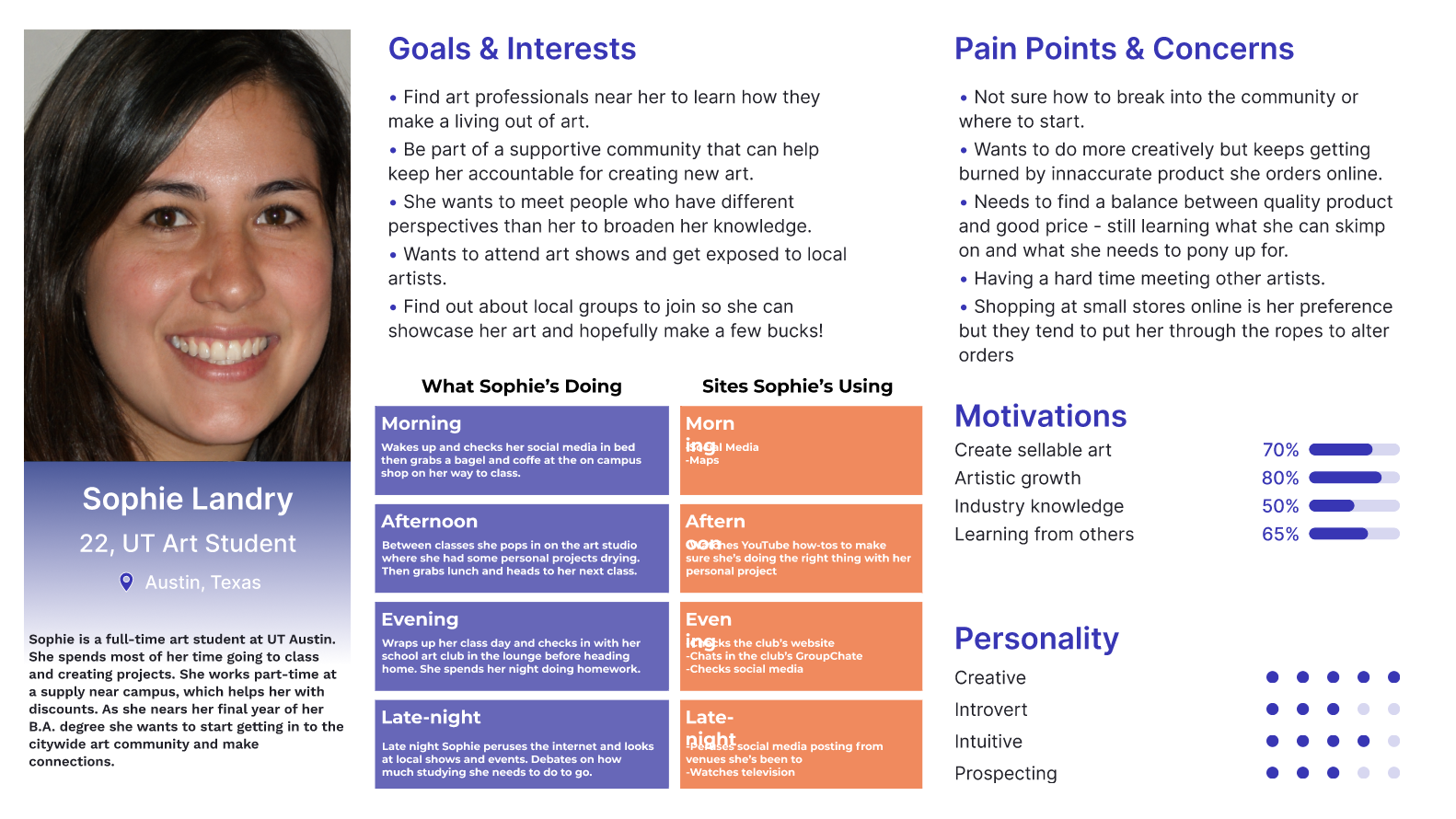
I was able to create a persona using the data from the user research affinity map. The persona altered the design by drawing focus to the pain points of the users, creating a context for the motivations of the user – part of which was the draw that local art stores have a tie-in with the local art scene. This was the angle to take.
Site Architecture
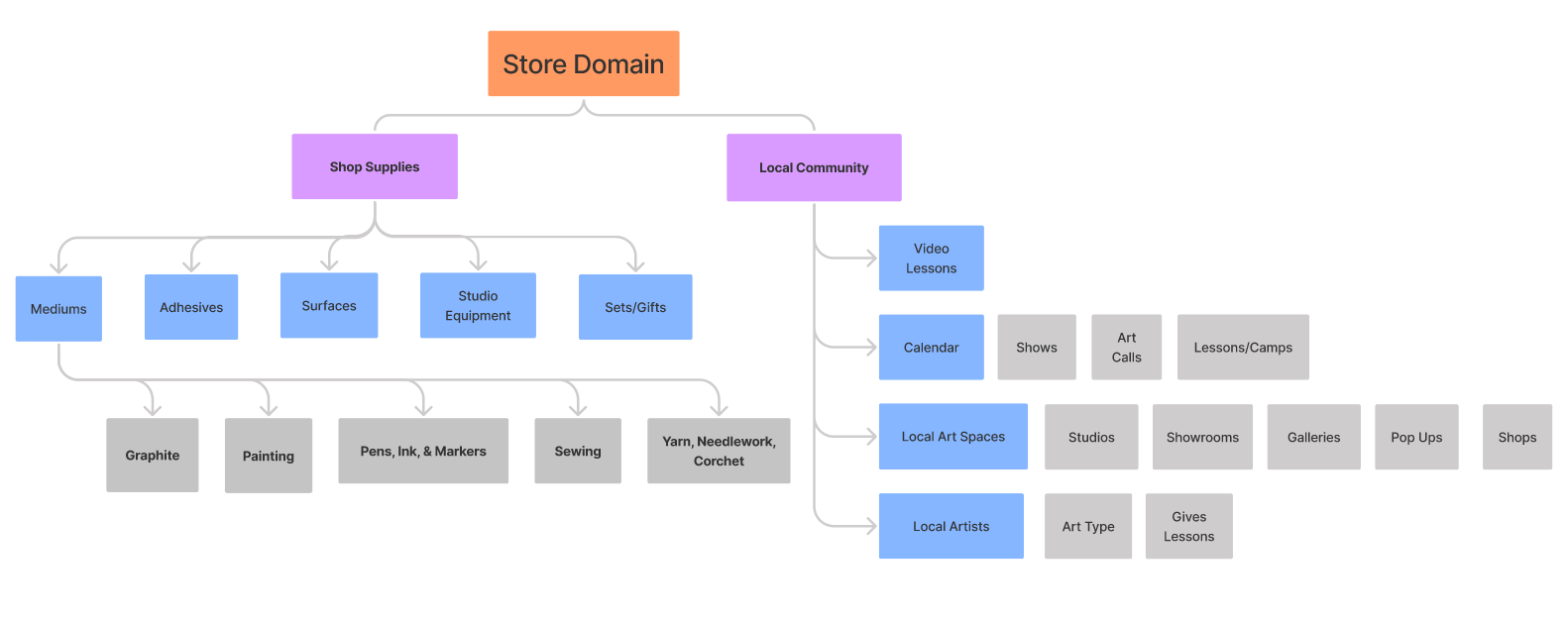
After coming to understand the wants and needs of the users, I was able to determine that users had two varying interest in local stores: buying art supplies or looking into the local art scene. The most clear way to present these competing interests without one drowning out the other was to establish two separate flows connected by the main page.
Open Card Sort
Expectation versus Reality
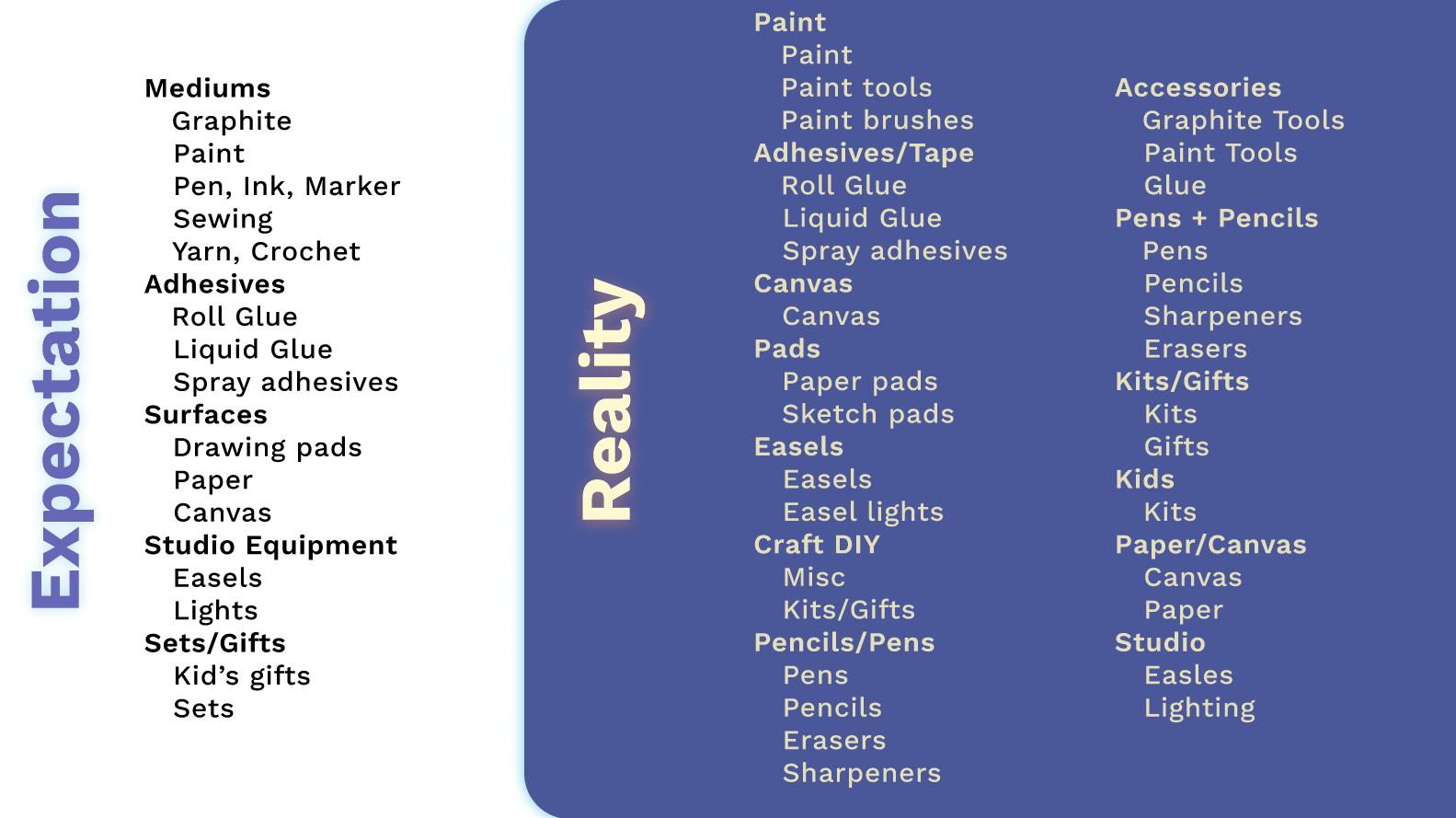
Presented with the list of items available at the store, card sort testers categorized the items in varying ways based on their own backgrounds or points of interest. On the left was the expectation, using art terms that are generally used by professional artists. On the right were terms that were chosen by testers as they are more accessible for non-professionals or hobby artists without the formal training. Since the store is presenting to the public, it made more sense to use terminology that is accessible to any level of understanding.
Discoveries
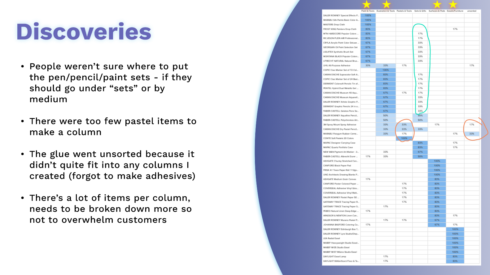
The card sort also hinted at the issues that would be reflected in the Maze testing – that gift sets were not easily sort-able and tools that can be used by multiple mediums were difficult to place as well.
Wire Framing
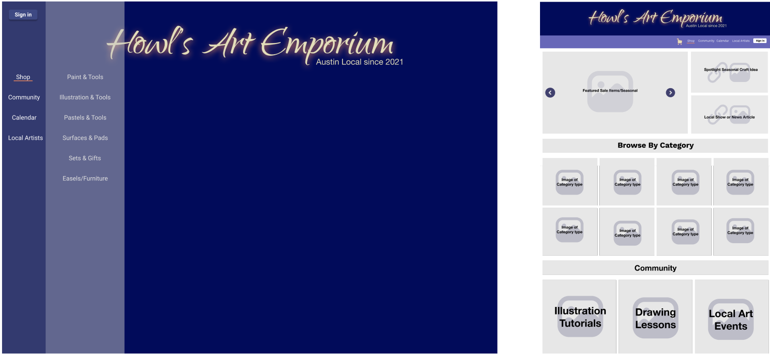
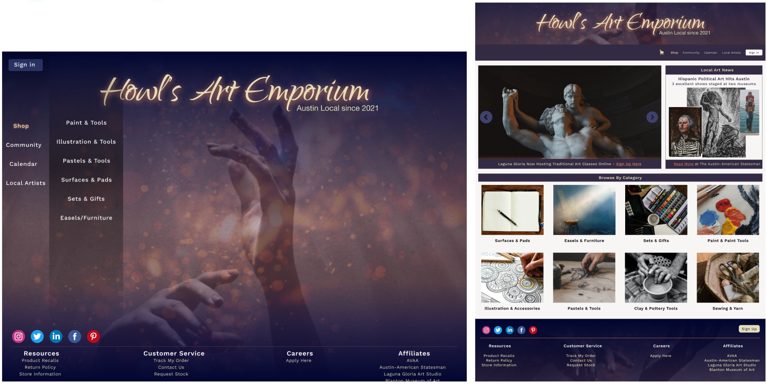
All the data gathered informed the initial design sketches. The two competing utilization of the website are shown on the first level menu so that the user is only seeing the information they are looking for instead of being overwhelmed by options. Subsequently, the secondary menu becomes more specific. On the right the basic page is shown, with subcategories listed as well as a features banner and a community banner below.
Mid-Fi Wires
Hi-Fi Wires
Usability Testing
Let’s talk about it!
Problem Area 1: Homepage Navigation
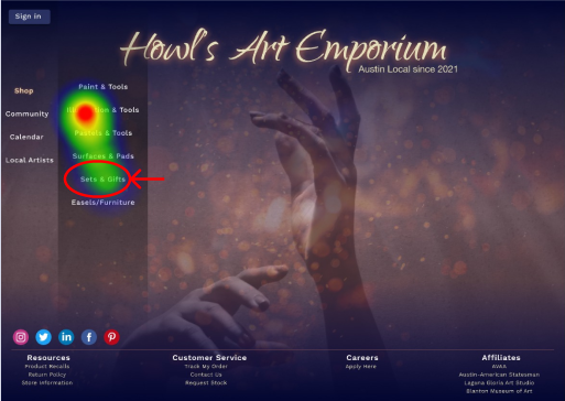
Users were given the task to buy a specific pencil gift set for a family member. Due to the placement of “Illustration & Tools” as being higher up on the options, users immediately tried to click on that link instead of reading the entirety of the list and clicking the “Sets & Gifts” down below.
Problem Area 2: Item Page
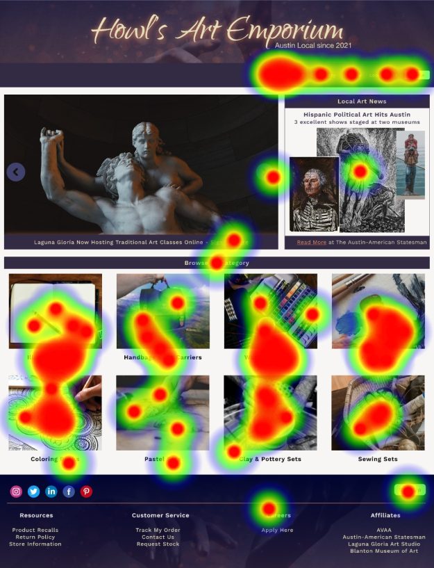
Look at this mess. The main item page wasn’t a complete failure because most users were still able to find what they were looking for… but in terms of user friendly design it was a complete failure.
First, users tried to click the top bar to search for what they were looking for instead of choosing from the categories below (the top bar wasn’t active for testing). After that didn’t work, users were frustrated and seemingly clicked at random. The pictures, though attractive, were too complex and it wasn’t clear which items would be in that category. Also, the image wasn’t clickable, only the text. All these issues were made glaringly obvious by every user.
The Results of Data-Driven Design
Problem Area 1: Home Page
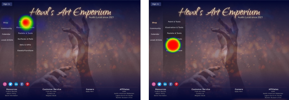
The solution to the first issue was to make the illustrations page clickable
and for sets to be listed within that page.
Misclicks went from 12.5% to 0%
80% of users chose the newly created path
Problem Area 2: Item Page
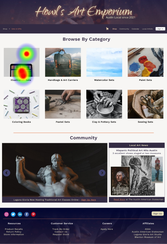
The solution to the second issue was to move down the feature banner,
make the images clickable,
and simplify the images showcasing the product being sold.
Misclicks went from 95% to 12.5%
Time spent on the page went from 37 seconds to 6 seconds
Overarching Success
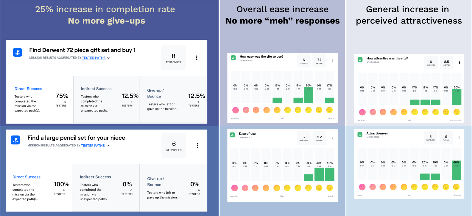
Design Alterations
– Make whole item cards select-able
– Simplify image cards even further
– Decrease width of the readable spaces, more gutter on the sides
Infrastructure
– Create community pages
– Color checks for items like paint
– More in depth about beginner-pro quality
– Collaborate with local artists, local art spaces, and local art authorities (AVAA, Blanton Museum)
